Controls
Almost all the drawing functionality you've learned about so far also applies to controls. Most controls inherit their class from UIControl, and as you can see in Figure 4.36,UIControl is a subclass of UIView; this is how controls know how to draw themselves.
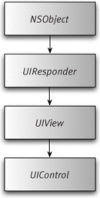
Figure 4.36 The UIControl class hierarchy.
You'll never actually create instances of UIControl directly the way you do with UIView.UIControl is simply used to define a common set of functionality and behavior for its subclasses.
As mentioned at the beginning of this chapter, controls use the target-action mechanism to respond to touch events. Since the iPhone is a Multi-Touch device, many different events can occur, such as tapping, multitapping, dragging, and releasing. Luckily, each control has been designed to respond to only those events appropriate for its usage, and each does so in an intuitive and consistent manner.
You'll now take a closer look at the controls available to iPhone developers.
Buttons
When adding buttons to your application, you'll use the UIButton class. The default initializer for buttons is the buttonWithType: method:
UIButton *myButton = [[UIButton buttonWithType:UIButtonTypeRoundedRect];
Figure 4.37 shows the default buttons types available.
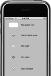
Figure 4.37 The default button types for UIButton.
To be notified when a button changes state, add a target and action:
[myButton addTarget:self action:@selector(buttonClick:) forControlEvents:UIControlEventTouchUpInside];
The UIControlEventTouchUpInside event is most commonly used for handling regular button presses.
The UIButtonTypeCustom type lets you create buttons with images or even draw them yourself using your own custom drawing code (as discussed earlier in the "Views" section).
To create a button with an image:
- Specify an image for the button's default state using NSControlStateNormal:
UIImage *buttonImage = [UIImage imageNamed:@"myButtonImage.png"];
[myButton setImage:buttonImage forState:UIControlStateNormal];
UIButton will automatically apply highlight effects to indicate that the button is pressed or disabled. - You can also set multiple appearance properties for each of these states, including the title text, font, and color.You can use different images for the four different states: the default (as shown in step 1), highlighted, selected, and disabled. This enables you to create buttons to represent other controls.
To create a checkbox button:
- Assign images for both of the buttons' states:
[checkbox setImage:[UIImage imageNamed:@"checkbox_off.png"] forState:UIControlStateNormal];
[checkbox setImage:[UIImage imageNamed:@"checkbox_on.png"] forState:UIControlStateSelected];
- Set the target method to call when the button is tapped:
[checkbox addTarget:self action:@selector(checkboxClick:)
forControlEvents:UIControlEventTouchUpInside];
- In the checkboxClick: method, simply flip the button's selected property:
btn.selected = !btn.selected;
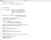
Since you've previously defined images for the two different states, the button automatically updates to display the correct image. Code Listing 4.29 shows the updated code.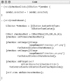 Code Listing 4.29 Creating a check box.
 Tip
Tip- If you specify an image or title for any button type other thanUIButtonTypeRoundedRect, the button effectively becomes a button ofUIButtonTypeCustom.
Switches
Switches, represented by the UISwitch class, let you create an on/off control (Figure 4.38).
Figure 4.38 Switches are used extensively in the Settings application of the iPhone.
To create a switch:
- Use the initWithFrame: method:
CGRect switchRect = CGRectMake(120,50,0,0);
UISwitch *mySwitch = [[UISwitch alloc] initWithFrame:switchRect];
Since switches are always the same size, the width and height properties are ignored. - When you change a switch's value, it generates a UIControlEventValueChanged event:
[mySwitch addTarget:self action:@selector(switchAction:) forControlEvents:UIControlEventValueChanged];
- To turn a switch on/off, call the setOn:Animated: method:
[mySwitch setOn:YES animated:YES];
Switches don't have any properties for modifying the default visual appearance, but with a little digging, you can control a couple of elements.
Figure 4.39 shows the control hierarchy of a UISwitch. The "on" and "off" elements are both UILabels. You can manipulate the text, font, color, and more.
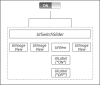
Figure 4.39 The control hierarchy that makes up a UISwitch.
To alter the appearance of a switch:
- To retrieve the two UILabels within the switch that hold the switch's text, you can use this:
UIView *mainView = [[[[mySwitch subviews] objectAtIndex:0] subviews] objectAtIndex:2];
UILabel *onLabel = [[mainView subviews] objectAtIndex:0];
UILabel *offLabel = [[mainView subviews] objectAtIndex:1];
- Now you can change the text and color of these labels. The choice of text values is quite limited since the labels are small in size and are clipped by their containing view:
onLabel.text = @"YES";
offLabel.text = @"NO";


onLabel.textColor = [UIColor yellowColor];
offLabel.textColor = [UIColor greenColor];
- When setting the text values you should localize your replacement text wherever possible. Code Listing 4.30 shows the updated code.
 Code Listing 4.30 Customizing the switch control.
Sliders
Although switches have only two possible states, sliders let you select from a range of values on a horizontal bar, or track, with a thumb indicator that can be moved from side to side to select values (Figure 4.40).
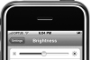
Figure 4.40 The brightness slider control indicates the change in value with graphics at both ends of the control.
Unlike the UISwitch, there's quite a lot you can do to customize the visual appearance of sliders, such as putting images to represent the values at either end of the track. You can also customize the thumb image and the graphics that appear on the track on both sides of the thumb as the values change (Figure 4.41).
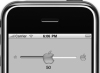
Figure 4.41 A custom slider control.
Just as with the UISwitch, sliders create a UIControlEventValueChanged event when their value is changed. By setting the continuous property, you can choose to have these events fired either as the slider is changed or at the end of a change. Code Listing 4.31demonstrates this with a custom UISlider, with minimum, maximum, and thumb images. In the sliderAction: method, you are forcing a "step" behavior, making the slider jump to the next value in increments of ten. A label added to the view displays the current slider value.
Code Listing 4.31 Implementing a custom slider.
Tips- Although not specified in the developer documentation, setting the thumb image of a UISlider also hides the tracking image. You must also set the minimum and maximum track images.
- The stretchableImageWithLeftCapWidth:topCapHeight: method lets you create an image that can stretch in the center but does not stretch on either side, as shown in the rounded edges of the track images.
Segmented controls
The UISegmentedControl consists of a horizontal control divided into segments (Figure 4.42). Segmented controls are useful for allowing users to pick from a group or set of values.
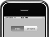
Figure 4.42 A segment control.
Each segment functions as its own button. By default, selecting a segment will deselect the others in the control (much as a radio button does in HTML). You can alter this behavior by setting the momentary property.
To create a segmented control:
- Create an array of UIImages or NSStrings, and then call the default initializerinitWithItems: (Code Listing 4.32).
 Code Listing 4.32 Creating a segment control.
 - Set the frame, and the control will automatically resize to accommodate its segments. Each segment will initially be the same size.
- Set the width of individual segments using the setWidth:forSegmentIndex: method.This will automatically resize any other segments that have not had their widths explicitly set to fit within the control.
- Select segments using the setSelectedSegmentIndex: method.
- Disable individual segments using the setEnabled:forSegementAtIndex: method.
- Add more segments using insertSegmentsWithImage:atIndex:animated:orinsertSegmentsWithTitle:atIndex:animated:.
- Set the animated property to YES so your segments will "slide in" as they are added.
- To remove segments, use the removeSegmentsAtIndex:animated: method.
- Use removeAllSegments to clear the entire control.
Segment control styles
Segment controls have three different styles (Figure 4.43), which can be set using the segmentedControlStyle property. Set the style to UISegmentedControlStyleBar to change the color of the control via the tintColor property, but depending on the color you use, you may not be able to see the difference between selected and unselected. Code Listing 4.33 shows an example of how to use some of the properties of a segmented control.
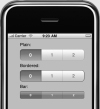
Figure 4.43 The three styles available for segmented controls.
Code Listing 4.33 Setting some of the segment control properties.
Use the UISegmentControl to create a "glass" alternative to a UIButton. Use thetintColor property to change the color of the button.
< Back Page 11 of 11
No comments:
Post a Comment